UI Refinement
Polished and improved the existing interface for better clarity and consistency.
Building Products e-commerce
Taiga Building Products’ distribution and logistics allow its customers to supply building materials for residential and commercial projects.

I joined as a UI/UX Designer, responsible for restructuring the design files and establishing a consistent system. Working closely with the team and stakeholders, I helped evaluate the existing experience and co-created new feature ideas to improve usability for B2B customers.
UI Refinement
Polished and improved the existing interface for better clarity and consistency.
Design Guideline
Built and standardized a design guideline to unify components across the product.
Feature Ideation
Collaborated with the product team to brainstorm and define new features that enhance the purchasing journey.
UX Redesign
Restructured the user flow and interactions to make the buying process smoother and more intuitive.
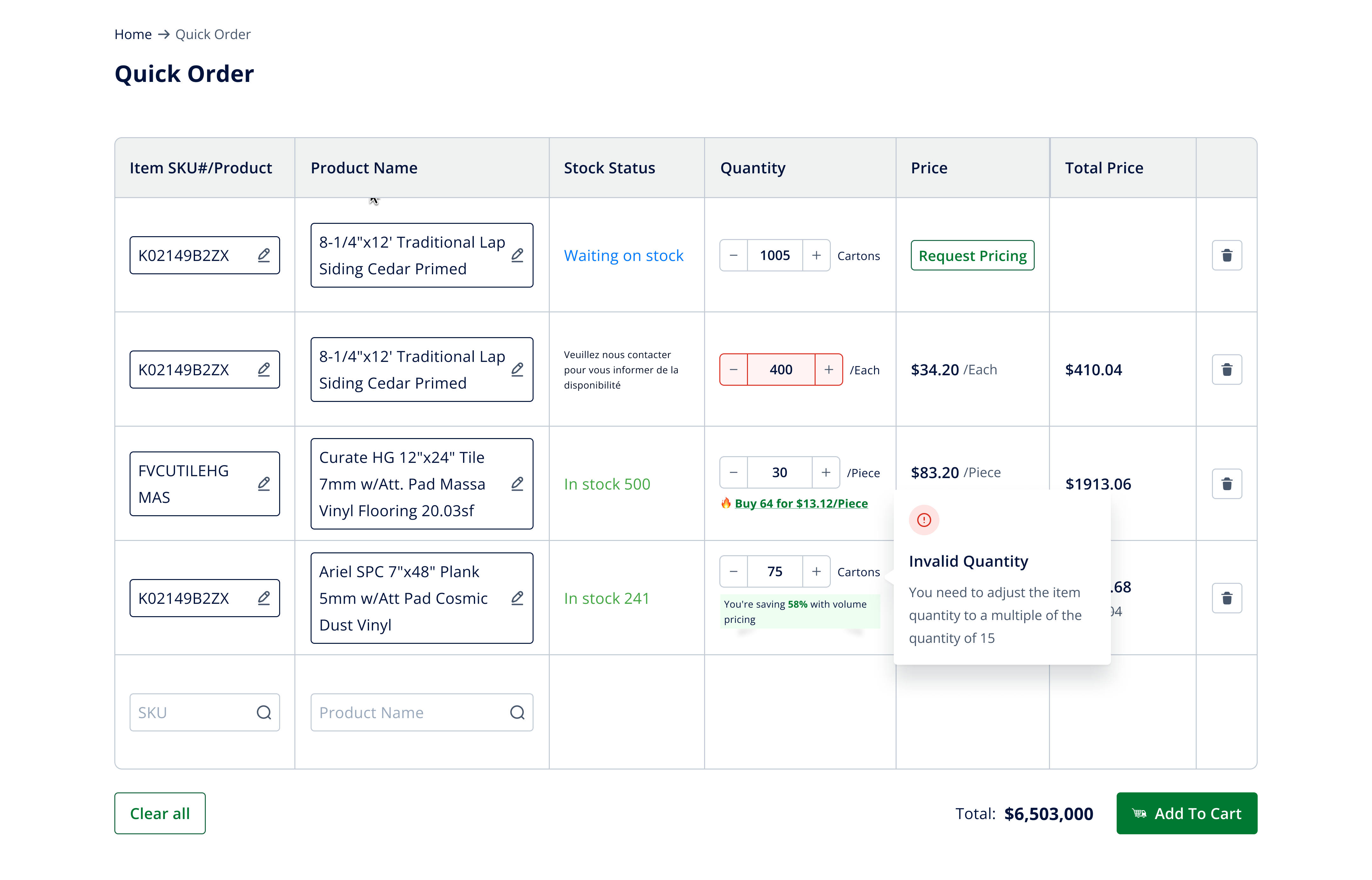
Quick Order Feature
Quick Order helps B2B customers place large-volume orders faster — by skipping product pages and entering SKUs or product names directly.
Designed for efficiency, this feature is based on user research showing that contractors and procurement teams often know exactly what they need. Quick Order streamlines bulk purchasing into just a few clicks.
Product Details
Redesigned the Product Detail page to simplify complex options and improve clarity for B2B buyers.
User research showed that contractors found the original layout confusing when selecting product variations. I restructured the interface and introduced clearer sections for materials, sizes, and finishes — ensuring buyers can quickly configure the exact product they need before purchase.

Through problem framing and user journey mapping, we uncovered that buyers often struggled with uncertainty around stock and delivery time. By prototyping and testing a modal that clearly displays availability, quantities, and lead days, we helped users make faster, more confident purchasing decision.

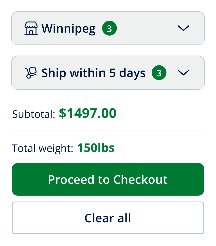
Cart
Redesigned the Cart experience to reduce confusion and make order management more intuitive.
Based on user feedback gathered by the PO, buyers found the original cart difficult to read and manage. I restructured the layout by grouping items by warehouse, enabling inline quantity edits and quick removal, and surfacing key details such as applied promo codes, unconfirmed prices, and cart totals. This streamlined approach made the cart more transparent and actionable for B2B users.
Price to be Confirmed When product pricing isn’t finalized, users can still add items to their cart. The system holds the order, and prices are confirmed later — ensuring purchase flow isn’t interrupted.
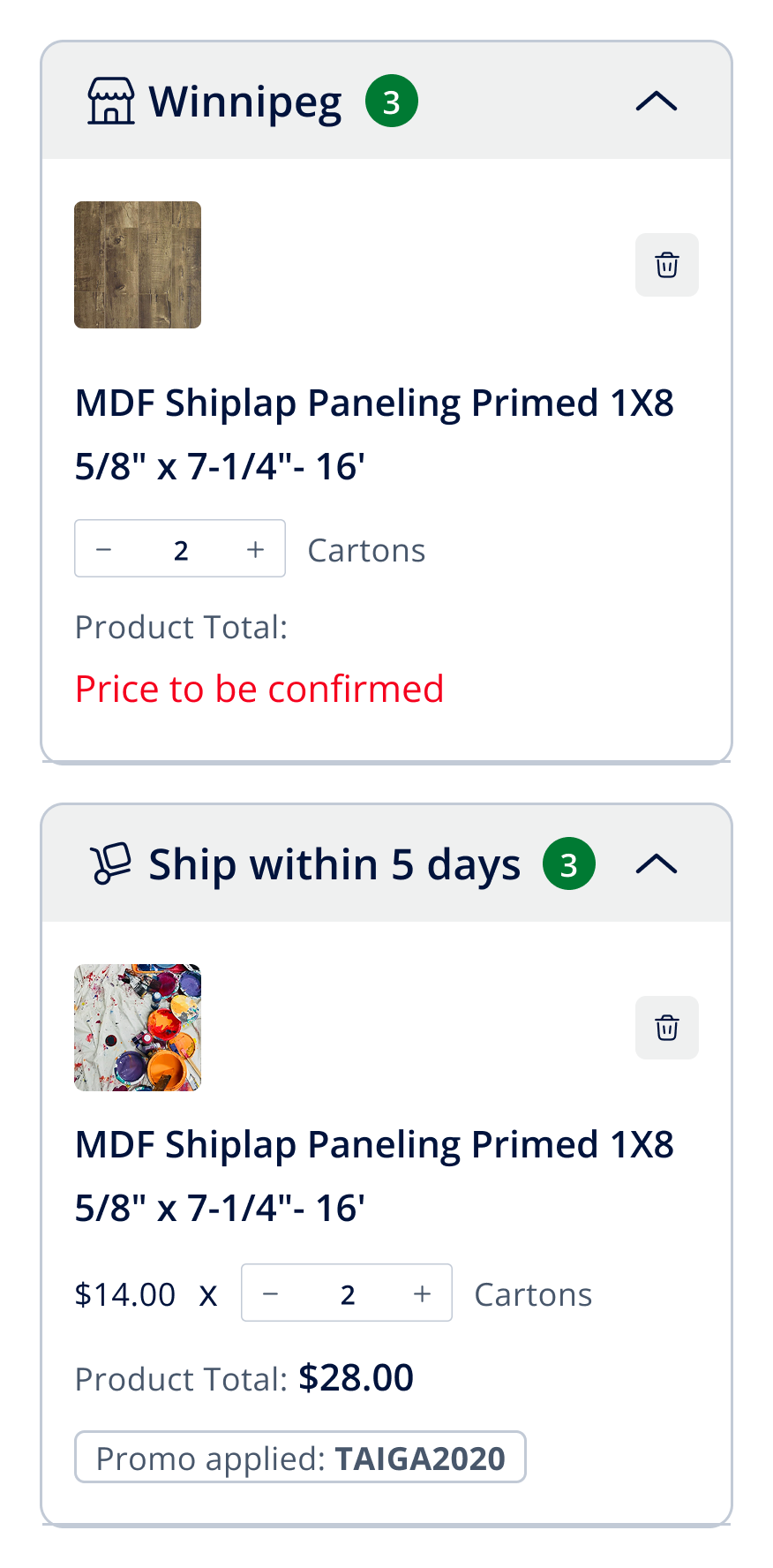
Grouping Products are grouped by warehouse in collapsible dropdowns, making large orders easier to review and track.
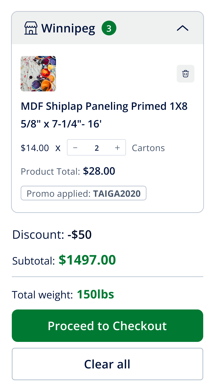
Key Information at a Glance Users can adjust quantities, remove items, view applied promo codes, and track subtotals — all directly within the cart, without navigating away.
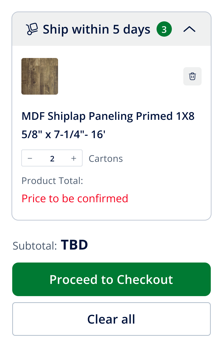
Total Weight Display The cart now shows the combined weight of all items, giving buyers the information needed to plan shipping and logistics more effectively.
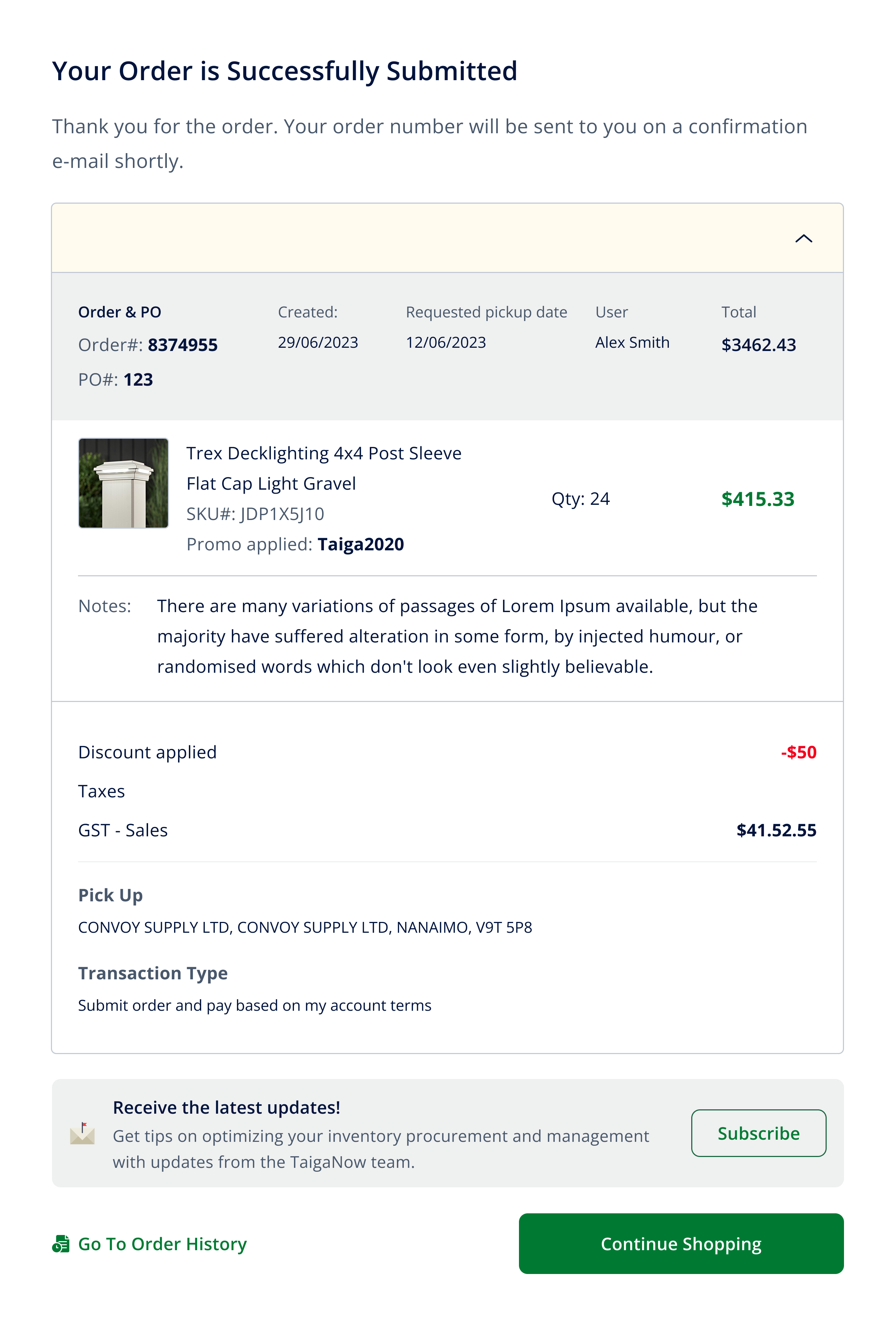
Checkout Step
Redesigned the Checkout page to bring clarity and transparency before order confirmation.
All critical information — item details, grouped warehouses, quantities, applied discounts, taxes, and total weight — are clearly displayed in one place. Buyers can easily make final adjustments, review freight charges, and confirm with confidence. This streamlined design reduces friction and builds trust during the most important step of the purchase journey.

Clear order confirmation with full details at a glance - Users instantly see order number, items, discounts, taxes, and pickup info, with clear next steps to continue shopping or review order history
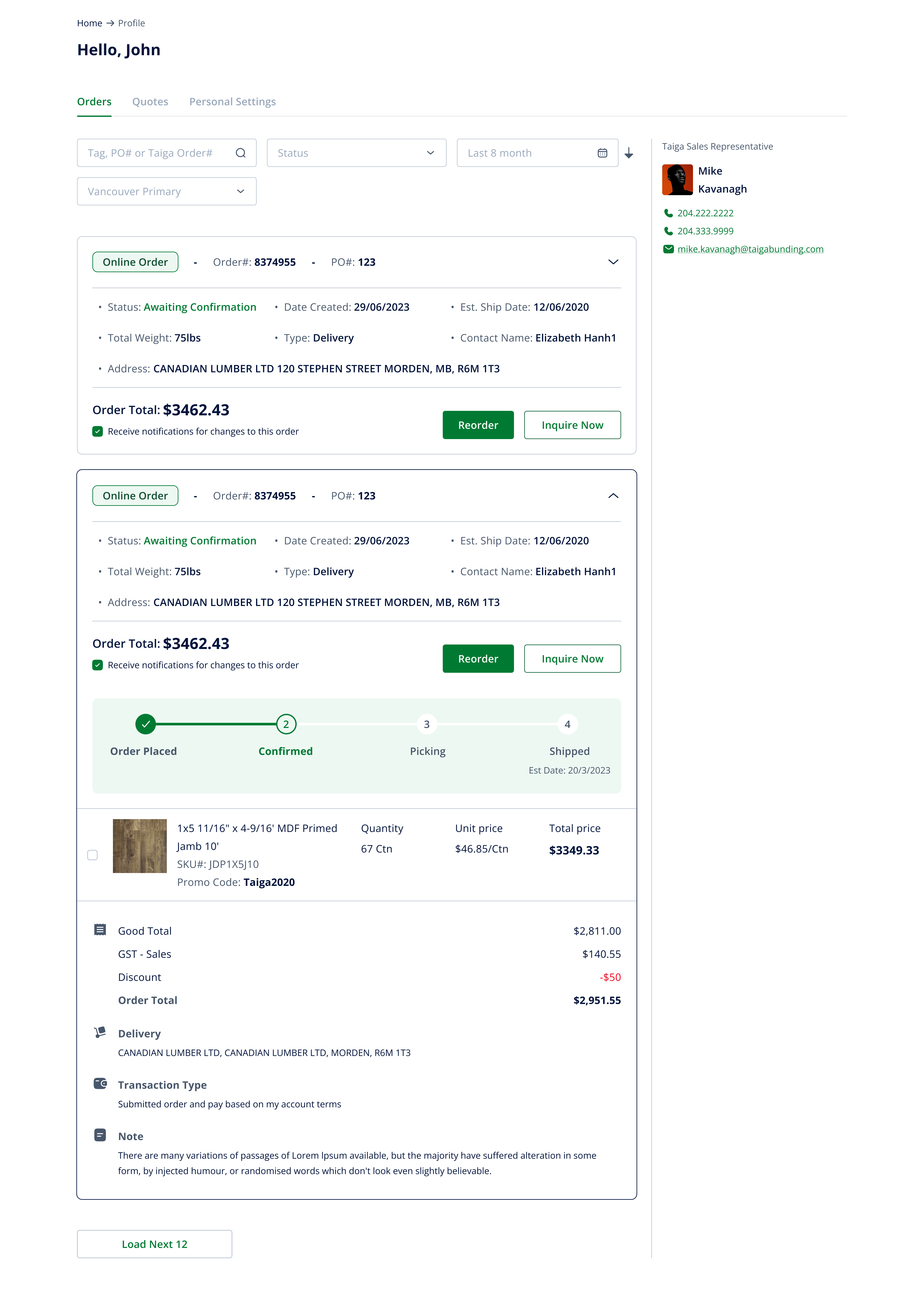
Profile Management
Redesigned the Profile Page to give B2B customers a clear overview of their orders, quotes, and account settings.
The new layout makes it easy for users to track order status, reorder frequently purchased items, and directly contact their sales representative. By surfacing essential details (dates, delivery info, order progress) in a structured and transparent way, the profile page helps reduce confusion and improves trust in the platform.
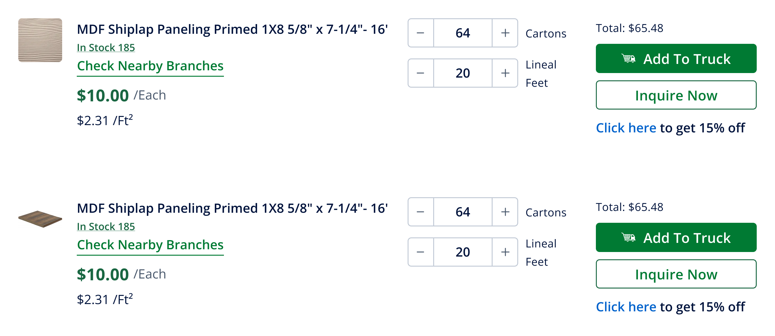
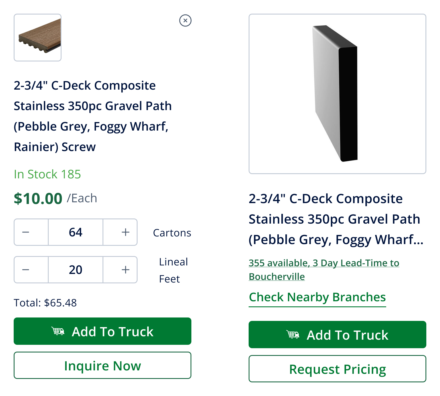
Product Item
Standardized product cards for quick scanning and easy navigation.
Each card clearly displays stock status, price, and key actions (Add to Cart, Inquire, Request Pricing). This structure allows B2B buyers to make faster decisions at a glance and seamlessly move into the product detail page when they need more information.
Display products in a clean vertical layout, highlighting details like stock, price, and actions. This view supports quick scanning and easier comparison across multiple items.
Showcase products in a grid format, balancing visuals and key info. Buyers can browse more items at once while still accessing core actions.
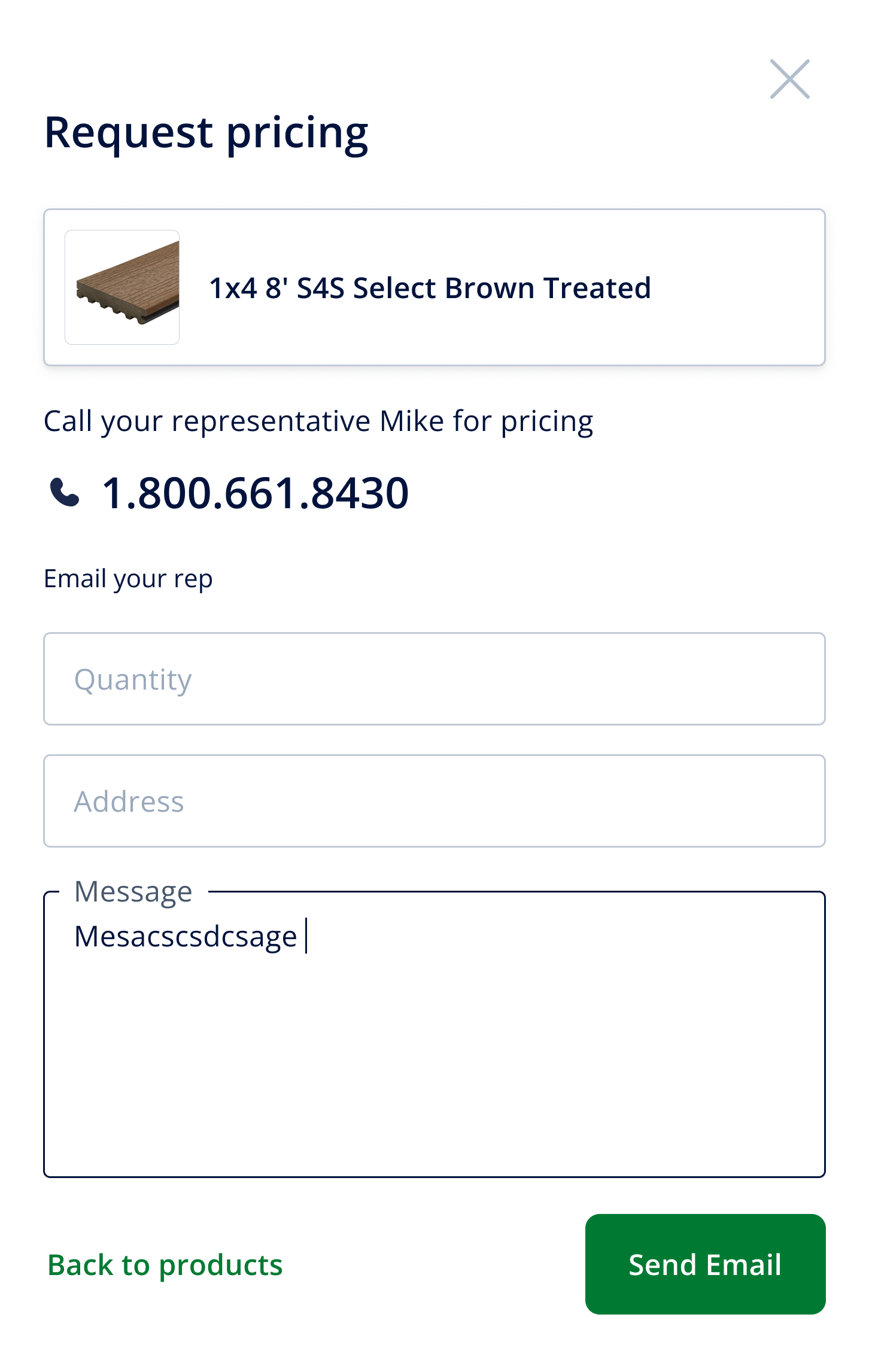
When prices aren’t visible, users can request a quote directly. A simple popup collects details, ensuring seamless communication with sales without breaking the shopping flow.
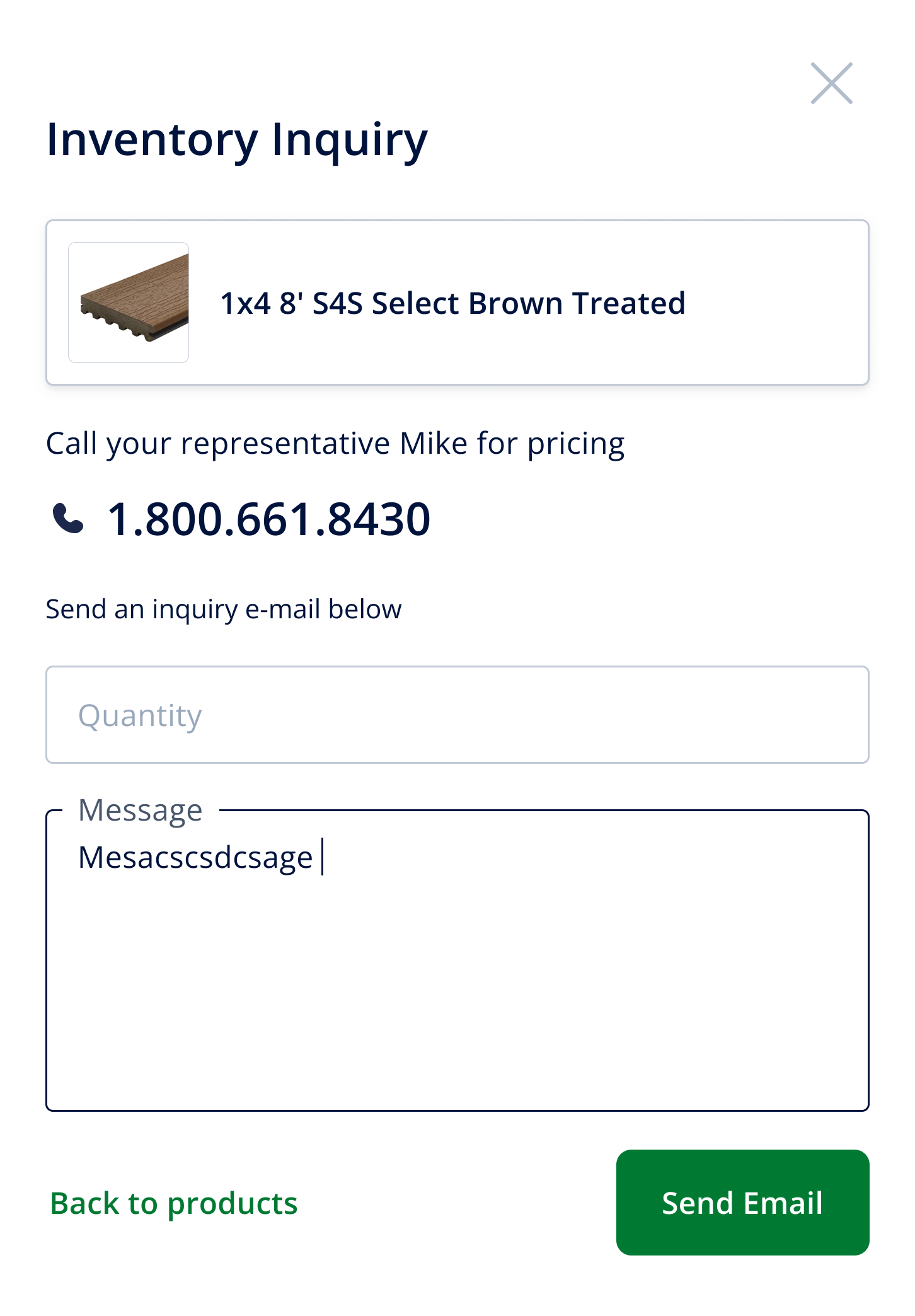
Buyers can instantly check stock availability through a popup. This feature surfaces real-time quantities and warehouse locations, helping B2B customers plan purchases and logistics with confidence.
I help teams turn complex flows into clear, intuitive interfaces. Available for freelance & short/long-term projects.